Windowkill Mods and Custom Assets
With the release of Windowkill v3.2.0, every part of the game is now fully customizable. Custom Assets allow users to quickly create and modify specific areas of the game, such as custom cursors and window themes. Mods cover everything else, allowing full customization of the game's code.
This document covers everything you need to know about customizing Windowkill!
Source Code and Assets
With the v3.2 update, I have provided the game's source code as well as the code for the custom version of Godot that runs the game. Additionally, I've open-sourced all the assets used in Windowkill.
Information on Windowkill's source code can be found here.
Windowkill Mods and Custom Assets
A directory of mods and custom assets are included with the game since v3.2.0, in the game's install directory. Feel free to browse the /mods folder and the /custom/... folders for examples on how mods and custom assets are organized and created.
The example mods have been removed for the moment, you can get them here:
torcado-nametag
torcado-nametag_rainbow
Installing mods and custom assets
There are two main methods:
- Adding folders to the game directory
Every mod and custom asset is nothing more than a single folder with some files in it. Mods go in the /mods folder, and custom assets go in their respective directory in the /custom folder.
example: you want to install someone's custom window theme. If you have a .zip file, extract it first to get the contents. If the first folder in the zip is called
window_themes, open that to get to the asset folder(s).
In the game's install location, open/custom/window_themesand copy the asset folder(s) from the extracted zip into this directory.
If you have a mod, you can simply place the .zip in the/modsfolder.
- Installing items from the Steam Workshop
If an asset has been uploaded to the Steam Workshop, you can install it by simply clicking "subscribe" on the item and restarting Windowkill.
Once you open Windowkill, you should notice the newly added mods/custom assets in the "mods" menu.
Creating mods
Creating mods is much a more involved process than creating other custom assets. Windowkill modding has its own dedicated page here!
Creating custom assets
Every custom asset is a named folder with some files in it. The relevant files depend on the type of asset, but common to every custom asset type is the (optional) config.json file, which holds extra information.
To create a new asset, follow these steps:
- Open the folder for the asset type you want to make (e.g.
/custom/window_themes/) - Create a new folder with the name of your asset (e.g.
/custom/window_themes/mytheme/) - Create a
config.jsonfile, and any other files necessary for that type of asset (see below).
Alternatively, make a copy of any of the existing demo assets and make changes to your liking.
Custom assets are completely separate from mods, and don't require any of the steps listed in that section (except in order to upload to the Steam Workshop). All you need to know how to do is move files around and modify json files.
note: png, jpg/jpeg, and svg files are all supported formats for images. Any time .png is written, it can alternatively be any of the above.
Window themes
/window_themes
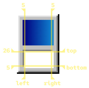
config.jsonnameString, name of assetauthorString, name of authorframeWidthsObject, 9-rect dataleft(default:0) Number, distance for left borderright(default:0) Number, distance for right bordertop(default:0) Number, distance for top borderbottom(default:0) Number, distance for bottom border
frameMarginsObject, margin offsets for frame widthsleft(default:0) Number, margin for left borderright(default:0) Number, margin for right bordertop(default:0) Number, margin for top borderbottom(default:0) Number, margin for bottom border
closeExpand(default:0) Number, margin size added to each side of the close button for click detectioncloseHideUnfocused(default:false) Boolean, if enabled causes the close button to hide when the window is unfocused, allowing the close button to be represented incontrolsUnfocused.pngtitleBarHeight(default:32) Number, Size of title bar, used to vertically align title texttitleOffset(default:0) Number, horizontal offset for title texttitleCentered(default:false) Boolean, whether the title is centered (true) or left aligned (false)titleColor(default:"#ffffff") Color, color of the title texticonOffsetObject, offset of the upper-left iconx(default:5) Numbery(default:-6) Number
controlsOffsetObject, offset of the controls imagex(default:0) Numbery(default:0) Number
flipControls(default:false) Boolean, causes the controls/close button to align to the left of the title bar whentrue(like MacOS windows).
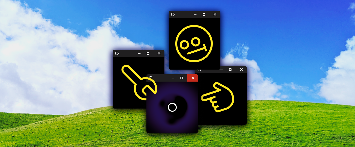
controls.png- The icons at the top right of the window
controlsUnfocused.png(optional)- The icons at the top right of unfocused windows, uses
controls.pngif not included
- The icons at the top right of unfocused windows, uses
close.png- The close button, will be overlayed on the controls image
closePress.png- The close button when pressed
frame.png- The window frame texture. This is a 9-rect, the values for its regions are to be defined in
config.json
- The window frame texture. This is a 9-rect, the values for its regions are to be defined in
frameUnfocused.png(optional)- The frame for windows that are not focused, uses
frame.pngif not included
- The frame for windows that are not focused, uses
Reference for the frameWidths values:
Backgrounds
There are two kinds of background: image and shader.
Image
/backgrounds
config.jsonnameString, name of assetauthorString, name of authormode(default:cover) String, possible options:coverscales image as small as possible that still covers all of the screen. Extra area is cropped off.containscales image as large as possible that keeps all parts of the image visible.
parallax(default:0) Number, amount the image moves in the direction of the game window. negative values move the image in the opposite direction.
- any image file
- (e.g.
bg.png)
- (e.g.
Shader
/backgrounds
config.jsonnameString, name of assetauthorString, name of authorshader_composite(default:false) Boolean, causes the shader to render above game elements when enabled. This allows for more complex visuals, like reflections.shader_audio(default:false) Boolean, allows the shader to read audio data from the game's music channel. The shader'saudioDatauniform will be populated with an array of 20 floats, representing the max amplitude of the frequencies in each 1/20th slice (between 0hz and 11050hz, with a bias towards the lower end) of the currently playing audio. (To help with flickering, these values interpolate over time. The interpolation is significantly faster when the value is increasing)
- any image file, which will be passed in as a texture at
tex0- (e.g.
texture.png)
- (e.g.
- any .gdshader file
- (e.g.
bg.gdshader)
- (e.g.
shader uniforms:
vec2 res //full screen size
vec4 windowRect //rect of the game window relative to the screen (x, y, width, height)
vec2 windowCenterFollow //position of a point smoothly following the window center
sampler2D tex0 //texture of the (optional) additional image provided in the asset folder
vec2 playerPos //player's position
vec2 playerVel //player's velocity
vec2 playerAim //direction of aim (not normalized)
int playerChar //player character index. order (starting at 0): [epsilon, nyx, bastion, zephyr, (unused), :), blip]
vec4 playerColor //custom color chosen by player
vec4 borderDist //arbitrary window edge push distance values, used for the border effects. (right, bottom, left, top)
float GAME_TIME //game's run time in seconds, pauses with game
//if shader_audio is enabled in config:
float audioData[20]
Backing textures
These are textures for the "backing window" option.
/backings
config.jsonnameString, name of assetauthorString, name of authorcolorable(default:true) Boolean, allows the color slider to adjust the image's color. Anything white in the original image will become the selected color.
- any image file
- (e.g.
bg.png)
- (e.g.
Skins
Skins for characters, like Hector and the crown.
/skins
config.jsonnameString, name of assetauthorString, name of authorcharacter(default:all) String, the character the skin applies to. Possible options:allapplies to every characterepsilonnyxbastionzephyr:)blip
replace(default:true) Boolean, causes the custom sprites to replace the default ones when enabled, otherwise the custom sprites will be overlayed. If using "all" characters, this should probably be false (but you can enable it anyway if you want).
bg.png- background layer image (this is used for the black outline for most characters)
fg.png- foreground layer image
Music
/music
config.jsonnameString, name of assetauthorString, name of authorloop_offset(default:0) Number, time in seconds from the beginning of the file. When the end of the audio is reached, it will jump back to this position, allowing for an intro section leading into a looping section.boss_offset(default:0) Number, time in seconds from the beginning of the file. This is the time the audio will start at when the ??? fight begins.
- any music file (mp3 and ogg supported)
- (e.g.
music.mp3)
- (e.g.
Player visibility images
This is a texture that appears on top of the player, for added visibility.
/player_visibility
config.jsonnameString, name of assetauthorString, name of author
- any image file
- (e.g.
image.png)
- (e.g.
Cursors
/cursors
config.jsonnameString, name of assetauthorString, name of authorcenterObject, location of the click position. By default, the top-left of the image is where the click is centered.x(default:0) Numbery(default:0) Number
scale(default:1.0) Number, default scale for the cursor. Ideally the supplied image is scaled up enough to cover a 256x256 area, so that it looks crisp when the "cursor scale" setting is set to max. This number denotes the scale of the supplied image, causing the displayed cursor to be downscaled by this much when "cursor scale" is set to 1.interpolation(default:1) Number, interpolation method used when scaling. Possible options:0Nearest-neighbor (use this for pixel art cursors)1Bilinear (use this for everything else, ideally)2Cubic3Trilinear4Lanczos
delay(default:0.1) Number, the delay in seconds between each animation frame, if applicable.
- any number of images files
- (e.g.
1.png,2.png, etc.) - If more than one image is provided, it will create an animated cursor that plays the frames in order (names sorted lexicographically).
- (e.g.
- any image file
- (e.g.
cursor.png)
- (e.g.